When I work with clients, one of the most common requests is to find a way to bring more natural light into the house. In Philadelphia, especially, the houses are generally pretty dark. Long, narrow lots on narrow streets equals lots of rooms with a small proportion of window to room area. In any room, you would typically get light from only one direction. My house is on the north side of an east-west street. This means that I get sun most of the day in the front rooms of the house, which face the south. The rooms at the back of the house don’t get any direct sun, since they face north. It would be great to have some windows on the sides of the house, but that’s not possible–we have neighboring rowhouses on both sides.
This brings me to the subject of today’s post. If we all lived on corners, then we’d all have great opportunities for getting ample sunlight into every room. Heck, we could even do some nice bay windows, and really get some light going! Unfortunately, many of the corner properties, at least in my neighborhood, appear to be occupied by vampires who want nothing to do with sunlight. I give you the following examples:
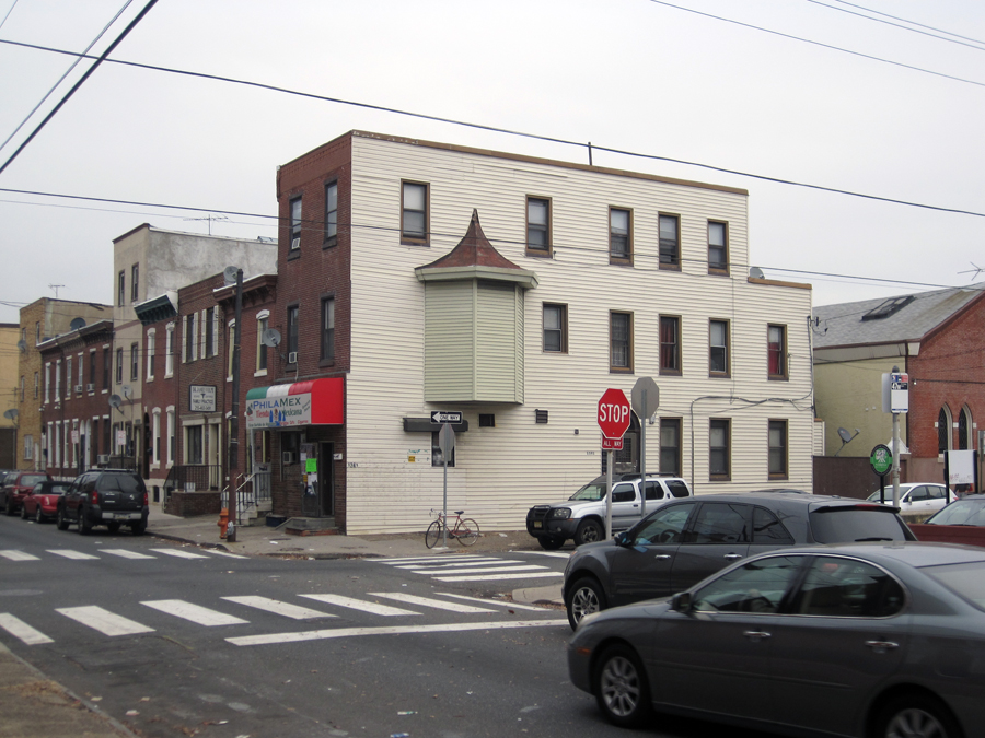
Two great bays! I assume that there were windows there at one time, but maybe now they’re just closets. It’s unfortunate, too, that a few other windows on this side have been infilled with glass block. Wouldn’t it be nice to be able to open them for ventilation? This house’s indignities don’t end with windows; you can see at the top of the front facade that the original cornice has been covered with siding, presumably to avoid having to maintain/repair/paint the old woodwork.
To this building’s credit, the original openings for the upper windows have been kept at their original size, though the replacement windows that went in there aren’t the nicest. But at the back of the second floor, you can see that beaten-up bay. . .it looks as though the original siding job kept the windows intact, but then later the windows were covered up. At the ground floor, lots of windows were filled in with brick (and not very nicely, either). At least this building still has its original cornice.
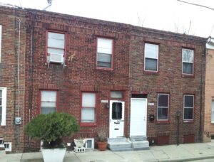
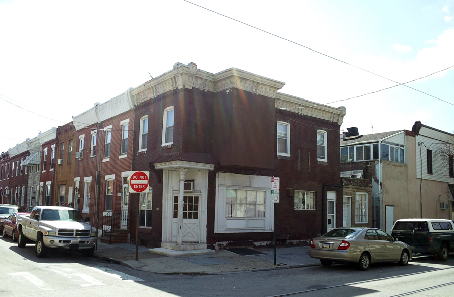 At least on a larger building, space isn’t really an issue. With one this small, however, that bay would provide a really nice expansion to the second-floor room, and the views out would extend the feel of the space even more than the actual square footage. This one is a real heartbreaker, because so much of the nice original detailing still exists–the ornate cornice, the original brickwork, the curved window opening on the front, the cast-iron column at the corner entry. The cheap windows could be upgraded, but it’s likely that that stuccoed-over bay will never be restored to anything like what it once was.

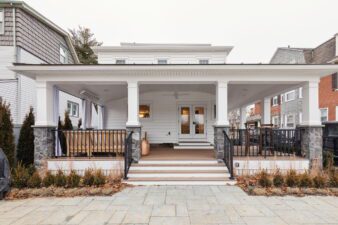
I don’t even really know what to say here. A great old building, obviously recently redone. It’s criminal. In the photo on the left, you can see where the original cornice was taken down and replaced by mismatched brickwork. What happened to the bays? So much lost opportunity.
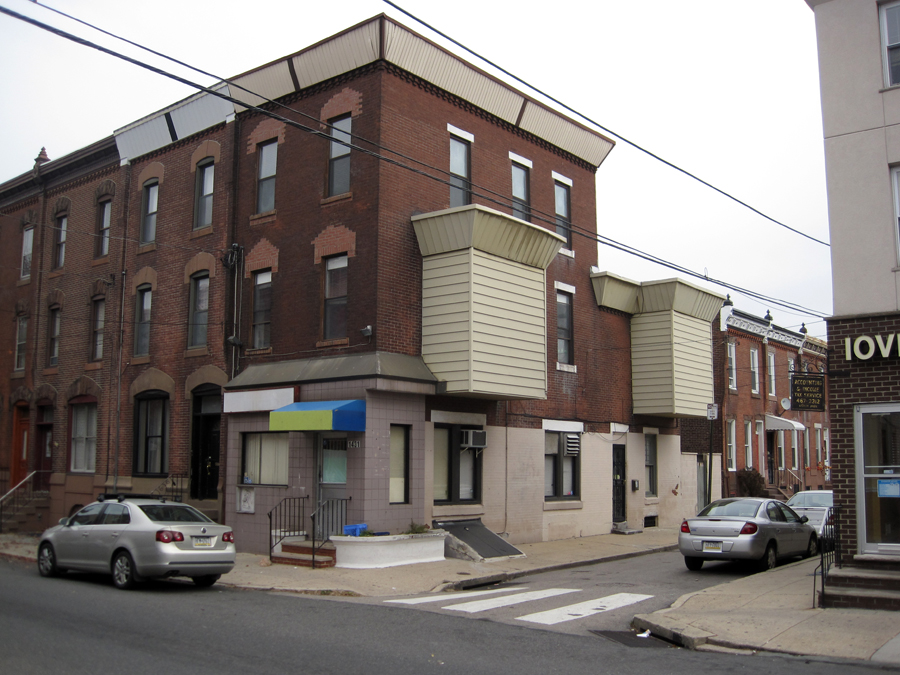
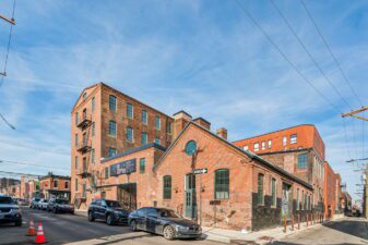
I wonder what’s going on with the old bay? Was that shape part of it, or is this someone’s sick attempt to get creative? Added bonus features are the loose electrical wiring at the back of the building, and the filthy tape residue at the front corner where the previous business owners used to put advertising signs.
It’s exciting to see a building and imagine its potential. The opposite of that feeling is seeing someone take a building with potential and squander it. I was no fan of vampires before, and after seeing what they do with all that daylighting potential, I like them even less.
