by Sara Pochedly
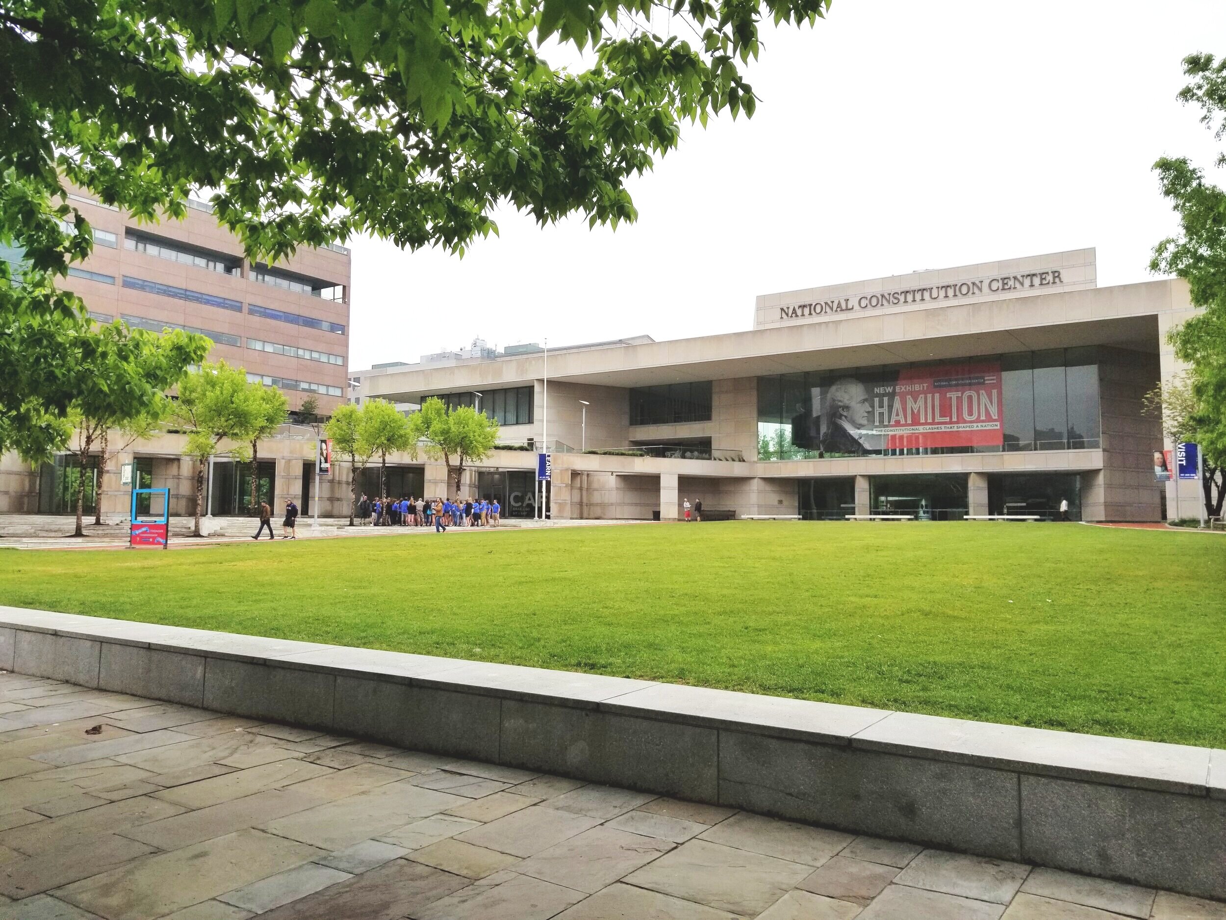
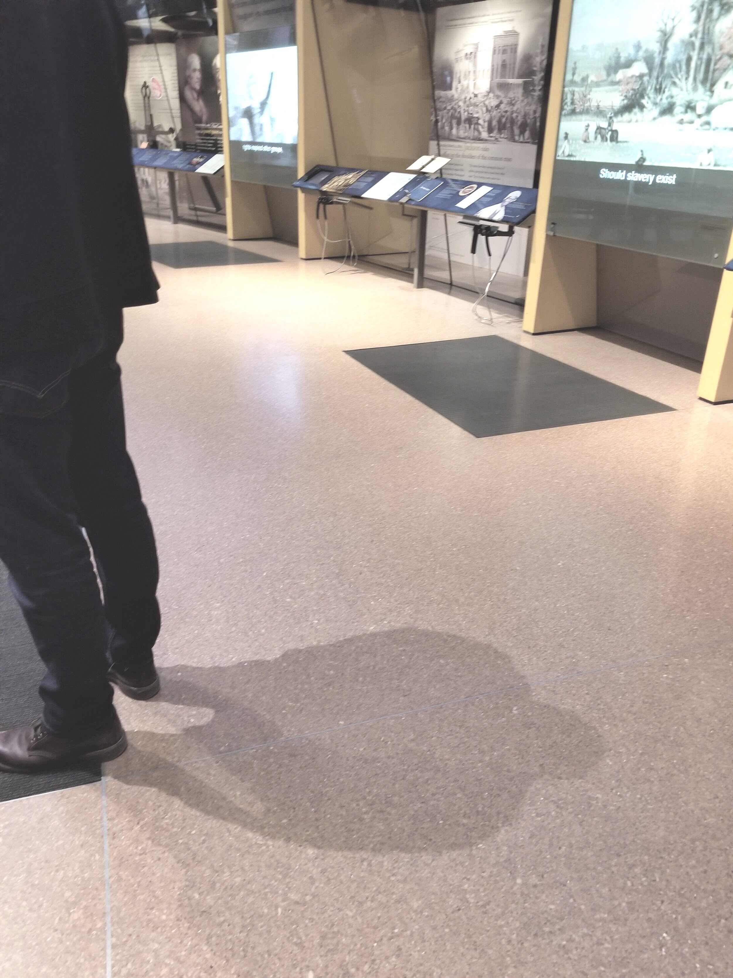
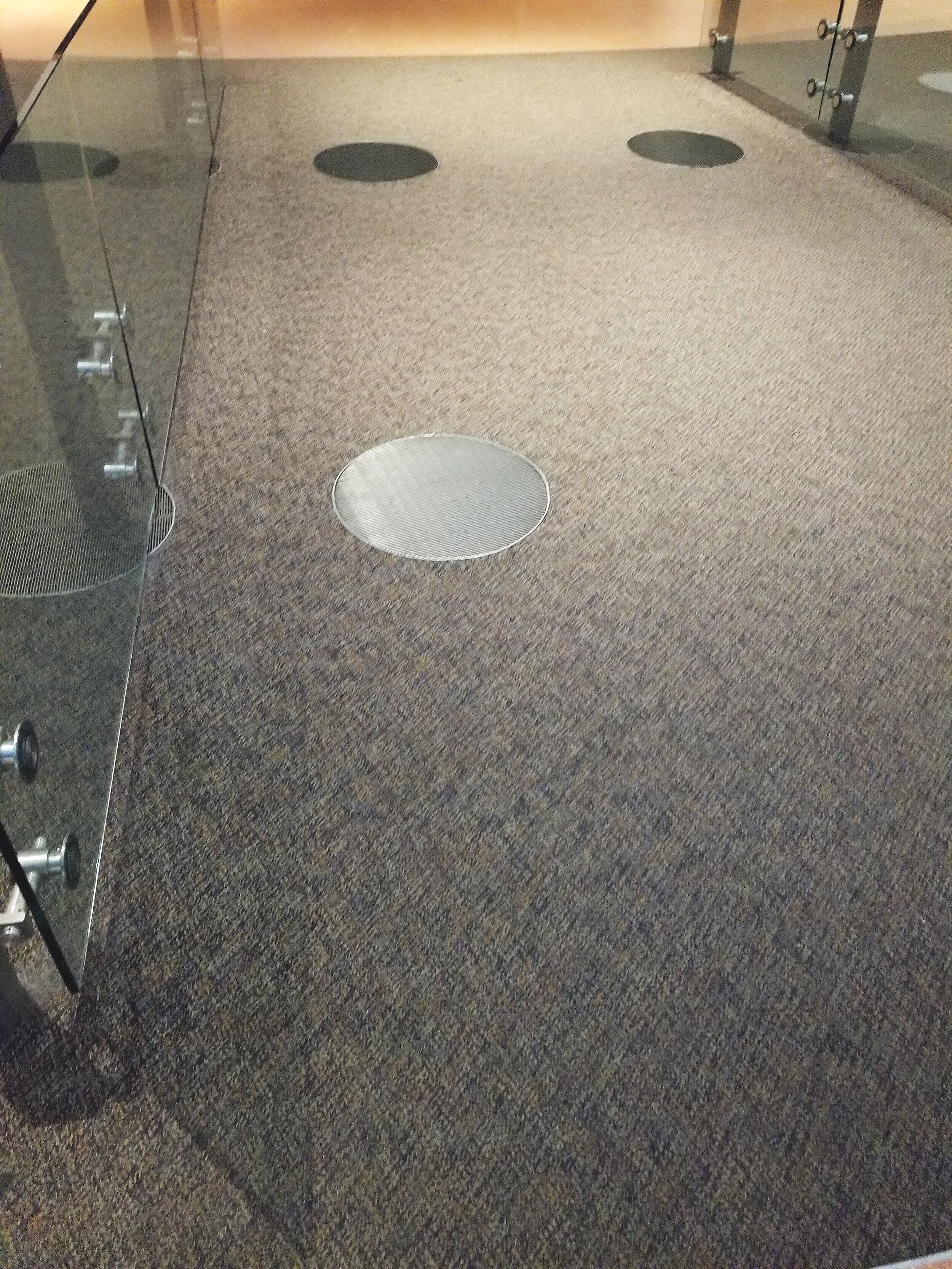
I recently made my first trip to the National Constitution Center located here in Philadelphia. As a designer I was really impressed by the permanent exhibit space. While there were approximately 100 people experiencing the exhibits, the room was surprisingly quiet. Looking around I could see a variety of screens playing videos, but there were no headsets, no phone apps and I could not hear any media sounds. And then all of a sudden, I stepped directly in front of a screen and the sound arrived! I looked to the left, then to the right, and lastly up towards the ceiling, but saw nothing. I thought, where is the sound coming from? And then I looked towards to floor and noticed that the flooring had changed from carpet to a metal grate and realized the focused sound was coming from the floor! Scanning the rest of the room I soon realized that many of the exhibits had these grates. While they were not completely invisible, these grates blended into the background, and yet they were the most impactful part of the exhibit. They made the exhibits engaging because as you moved from area to area, you continuously walked in and out of relevant audio/video clips. This is a great example of when good design is invisible.

